A designer brought a promo-activation flow to crit this week. The team had reached for a disabled checkbox to handle a pending state. It was almost right, and almost right is usually the most interesting place to start a crit.
In a crit this week, a designer brought forward a flow for activating an add-on feature with a promotional discount layered on top. The interaction had a few nested decisions sitting on the same surface: is the user activating the feature for the first time, are they already using it, is the promo eligible to apply, and does it apply now or after a trial period ends. The flow worked, in the sense that someone following a linear path through it would reach the right outcome. But something about it felt slightly off, and the designer correctly brought it to the group before shipping.
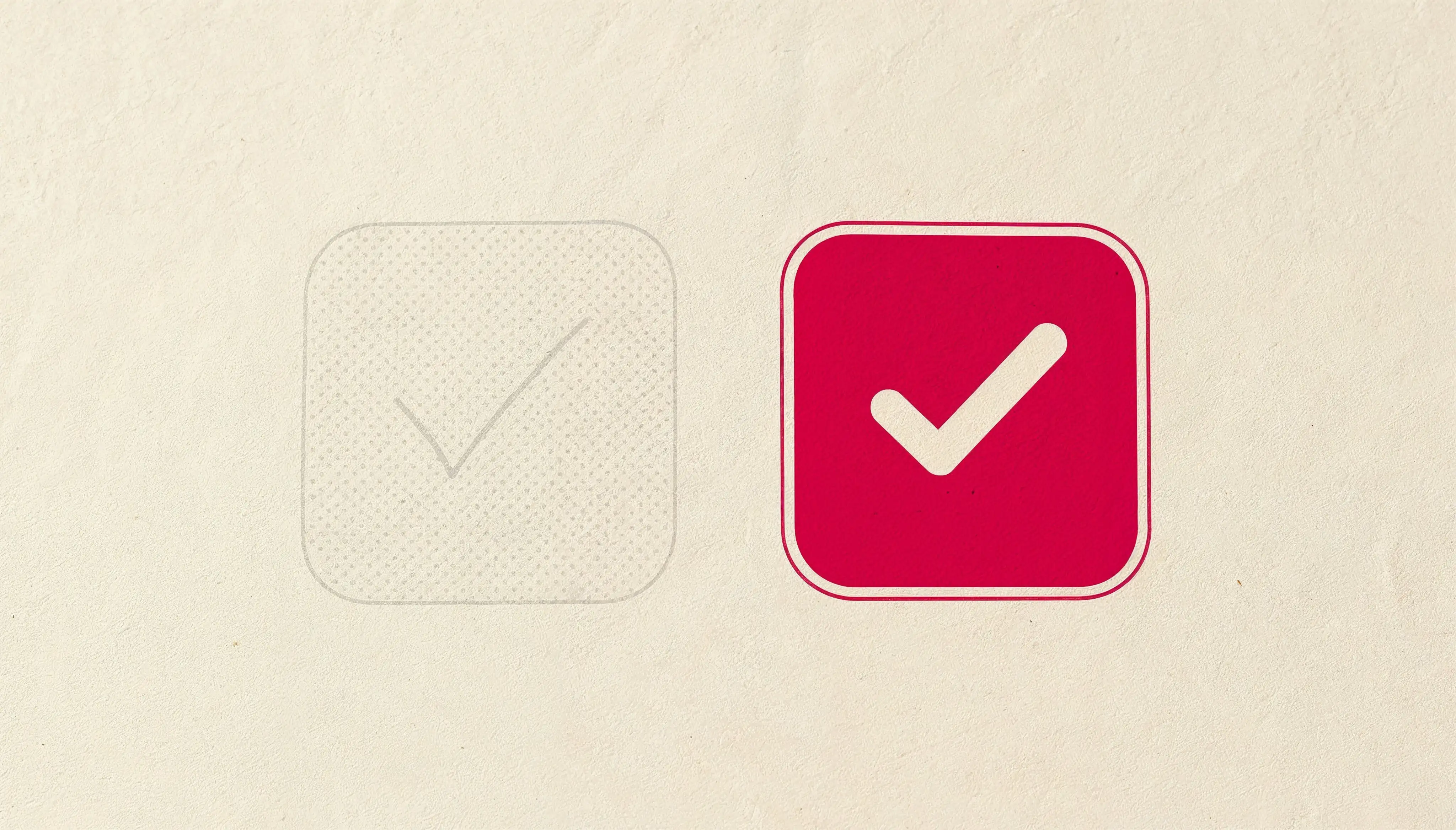
The thing that felt off was a checkbox.
The team had explored using a disabled checkbox for users who were currently in a trial. The logic was coherent on paper: the discount could not be applied yet, so the control was not actionable, so disabling it reflected that state. And visually, a grayed-out checkbox is a familiar affordance. We have all seen them a thousand times. They are the standard way of saying “this is not for you right now.”
And that is the problem.
What disabled actually says
Disabled states do not say “not yet.” They say “not for you, ever.” When a user sees a grayed-out control, the semantic weight of the design is telling them they are ineligible. That there is some characteristic of their account, their status, or their situation that has locked them out. The emotional response is closer to frustration or exclusion than to patience. The correct design response, when a user is in a pending state rather than an ineligible one, is almost never to disable the control. It is to remove, delay, or separate the decision.
In this case, the team ended up splitting the flow into two steps instead of collapsing it into one. Step one: activate the feature. Step two, shown only when eligible and timely: apply the promo. The two decisions live on different surfaces because they are actually different decisions. The user’s path becomes linear, and the disabled checkbox disappears. Not because we found a better style for it, but because the state it was trying to represent no longer needs to be represented at all.
A few downstream refinements came out of the same reframe. The call-to-action on the final step became “Apply Promo” instead of a generic “Confirm,” because the specific verb carries more meaning than the safe one. Individual user-state badges were removed in favor of a single section header because when every item is badged, the badge loses its signal.
The audit question
The crit lesson, which applies far past this one flow, is a small audit question I now use habitually when reviewing interfaces:
Is this state unchangeable, or is it just not-yet?
If the state is unchangeable, disabling is honest. The user cannot change their subscription tier, so the control should be disabled. The user does not have admin rights, so the action should be disabled. Disabled communicates “this will never be for you in this context,” and that is exactly what you want it to say in those cases.
If the state is merely not-yet, meaning if it will become changeable under different circumstances, or after another decision is made, or at a future point in time then disabling is dishonest. The control is present but unusable, which reads as a permanent state, which tells a lie to the user about their relationship with the interface. The fix is almost always to change the flow, not the control. Break the decision into steps. Delay the appearance of the control until it becomes actionable. Or move the logic elsewhere entirely.
The disabled checkbox is a wonderful affordance for the narrow case it was designed for. It is also one of the most widely misused patterns in product design, because designers reach for it the way writers reach for semicolons as a way of gluing together a thought that does not actually belong in one sentence.
Almost right is usually the most interesting place to start a crit. The designers had made a defensible choice, and they had also made a choice that could be slightly better. The gap between defensible and right is where most of the learning in design reviews happens. It is worth lingering there.