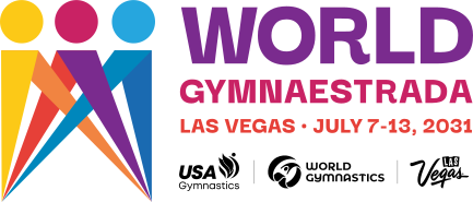
An event mark for the first World Gymnaestrada held outside Europe, drawn for USA Gymnastics and the Las Vegas 2031 host team in four rounds and twenty-five days, then built out as a brand guide anyone can open from a link.
- Client
- USA Gymnastics, for the World Gymnaestrada 2031 host team
- Scope
- Event mark, lockups, palette, type, motion and the brand guide site
- Timeline
- August to September 2026
- Status
- With World Gymnastics for federation approval
01 Challenge
The largest gymnastics event in the world hands out no medals, and since 1953 it has never been held outside Europe.
The brief
World Gymnaestrada comes around every four years. Twenty thousand gymnasts, dancers and circus performers, ages 1 to 100, fill a host city for a week and perform for each other instead of against each other. In 2031 that city is Las Vegas, the first edition ever held in the Americas.
James Helms, a friend from my Intuit days, introduced me to Lori Laznovsky at USA Gymnastics on August 4. Her brief fit in one email: a mark that feels elevated and a little moody, something new because event logos “tend to start to look alike,” ready inside two months so the international federation would have time to approve it.
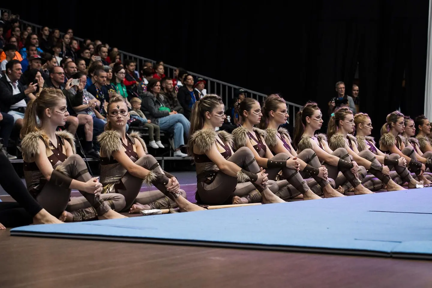
“Having attended 8 editions of this event myself, I always describe it as the world converging in one place to celebrate our sport with no boundaries or limits.”
Lori Laznovsky, USA Gymnastics
What the mark had to carry
- Elevated over expected. Edition marks have started to look like one another, and Lori has seen eight editions up close. She asked for something new, with the dark moodiness of the Las Vegas bid material.
- Vegas energy, not Vegas clichés. The city brings the spectacle, from Cirque stages to a new ballpark for the opening ceremony, and the gambling stays out of it.
- The magic travels. Lori told me this event would feel the same in any host city, so the place is the backdrop and the gathering is the subject.
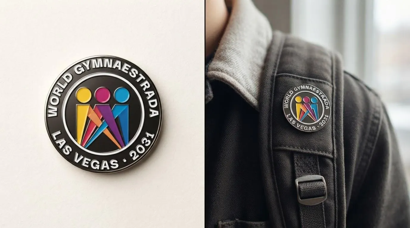
- The traded patch comes first. The mark’s first job is Lisbon, July 2027, where three hundred Americans trade shirts, jackets and pins with the world. It has to hold up at pin size and in one color on fabric.
- It lives in a lockup. World Gymnastics sits beside it on everything, and it has to clear USA Gymnastics and then the international federation.
02 Listening
Round 1 opened with the brief played back in their own words, before a single mark.
Kickoff, August 19
The kickoff was one call with Lori and Rosa Poetschke, who handles marketing and communications for the host team. I turned it into eight takeaways and a set of dials to judge every mark against, so by the time the first concepts showed up we already agreed on what good looked like.
Personality
“A performer who invites you in, rather than asking to be judged.”
Voice
“Human-scaled: a 7-year-old and a 70-year-old both see themselves in it.”
Mood
“Like the desert at dusk: heat and glow, never glare.”
From the Round 1 deck: the principles every direction was judged against.
03 Exploration
Four rounds in one running deck, and every round opened with what I heard.
How the rounds ran
I keep a client’s work in a single Google Slides deck with the newest round on top, so the whole history is one scroll away. Rosa sent her notes back as recorded videos, twelve generous minutes of them after Round 1, and each new round started with a slide that played those notes back before showing anything new.
- The introJames Helms connects me with Lori Laznovsky at USA Gymnastics.
- KickoffOne call with Lori and Rosa Poetschke.
- Round 1Six wordmarks, six mark directions and a playground.
- Round 2Twelve marks, twenty-five hours after the feedback video.
- Round 3Two finalists, each worked into applications.
- Round 4The trio without the green, 1 hour 39 minutes after the ask.
- The pick“The people trio logo.”
- ApprovalSent to World Gymnastics.
Round 1 · August 23
Six wordmarks and six mark directions, plus a playground of symbols. Each direction came in black and in color side by side, so the one-color version had to stand up before color could help it.


Round 1 feedback · what I heard
The solo-reading marks stepped back and the interlocking, everyone-together forms moved forward. Where shapes leaned feminine, I rebalanced them so every performer sees themselves in the mark.
Rosa saw a nod to Las Vegas and a group working together in one mark, and asked for it in color, with the overlaps deepening the shades.
A preview audience at USA Gymnastics caught a few marks echoing famous logos, and those left the table.
Rosa compared the marks they loved but wouldn’t lead with to a soccer team’s third kit. They live on as stickers and temporary tattoos, so nothing loved gets cut.
“You have a nod to Las Vegas with the spotlight, and then you also have kind of a group working together.”
Rosa Poetschke, Round 1 feedback video
Round 2 · August 29
Twenty-five hours after the feedback video: the naming order became World Gymnaestrada · Las Vegas · 2031, the way World Cup USA 2026 and LA 2028 read, the forms went group-first, the spotlight arrived in full color and the palette ran yellow and orange through pink and purple into the blues.


Round 3 · September 5
A knot drawn as one unbroken line, and a crowd made of light.


Why the trio
Rosa picked two on September 4. What sold the trio was its reverse: she said seeing a mark reversed before you ever need it is what saves the “uh-oh” moment later. From that round on, nothing appeared in positive without its reverse beside it, and both finalists went onto the first thing the mark has to do, the printed credential.

Round 4 · September 7, Labor Day
Without the green, one hour and thirty-nine minutes later.
Green had joined the trio in Round 3 to carry the whole spectrum. That afternoon Rosa asked to see it in the original colors, and Round 4 went back before the day was out. The solid gold, cerise and turquoise meant the enamel pins could run in full color too.


Drag to compare
“We have narrowed our choice down to the people trio logo.”
Rosa Poetschke, September 13
04 Identity
Many performers, one spotlight.
The mark
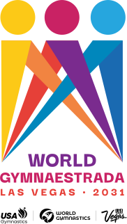
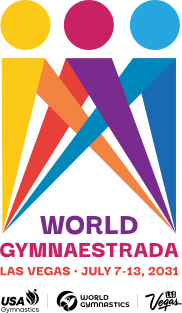
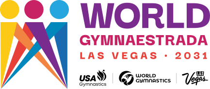
Figures step forward together, heads in gold, cerise and turquoise, and their bodies are the beams of a stage light meeting on one floor. Read it one way and it’s a group taking a bow with hands raised. Read it the other way and it’s the light finding them. Both readings are the event.
The family
Fourteen lockups, stacked, landscape, wide and medallion, dated and undated, each one shown beside its reverse so nobody meets the reversed version for the first time on a dark banner.








Color
Rosa asked for “the whole world, all the different colors” in the palette, so it runs yellow and orange through pink and purple into the blues. Gold, cerise and turquoise lead, and the greens that came and went from the mark stayed on in the palette for wayfinding and credential roles.
Type
Darker Grotesque does everything, and it’s open source, so no licensing bill waits at the end, which Rosa was glad to hear. The curled leg on the R gives the wordmark a little play. Capitals belong to the lockup and the partner row, and everything else is set in sentence case.
Everyone performs.
Motion
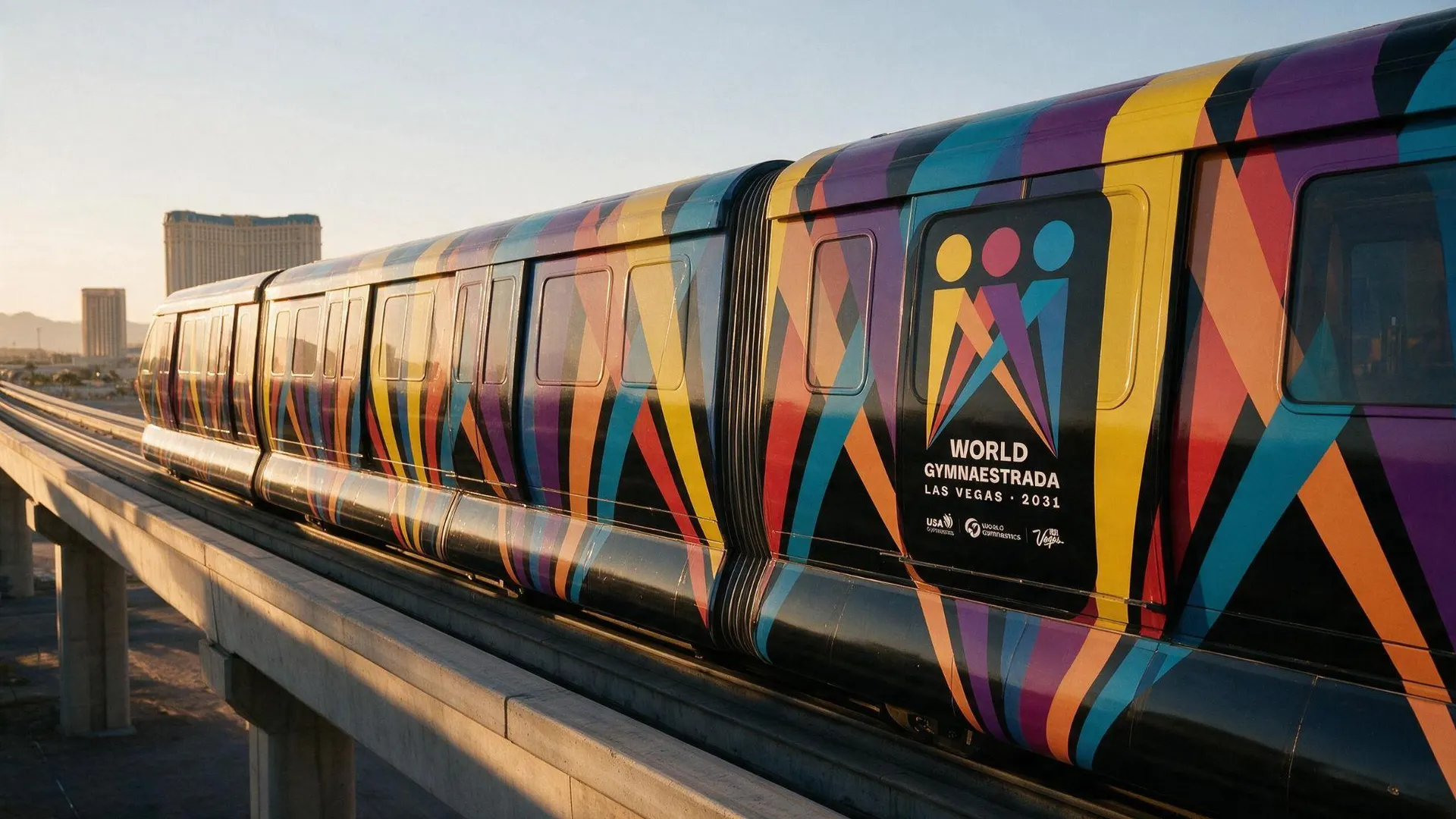
The beams are the pattern: stage lights rising from the ground line, swaying and walking front to back through one another. They carry the hero of the guide, the monorail wrap and every section break, and they run in plain CSS, so there’s no video to download.
The mark switches on the way it does at the top of this page. The beams draw up from the floor, drift, flash white like a car’s high beams and land in color. I directed it with voice memos and screen recordings, one timing note at a time, until the landing read as fanfare.
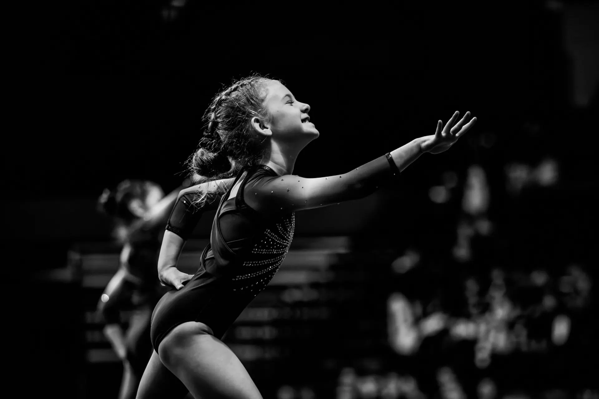
The beam field over one of Rosa Poetschke’s photographs, as it runs in the guide’s hero.
05 Application
One family, many stages.
Seven days in one city
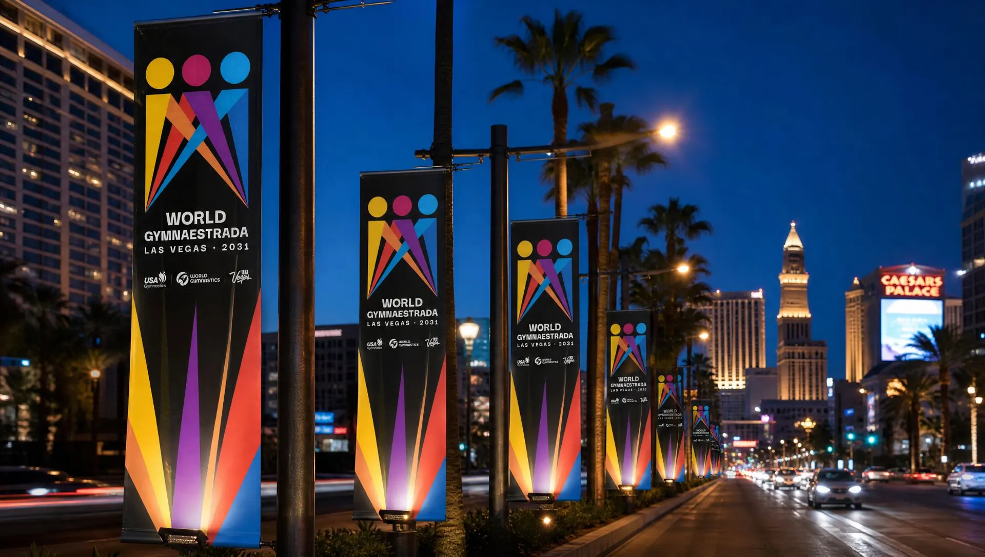
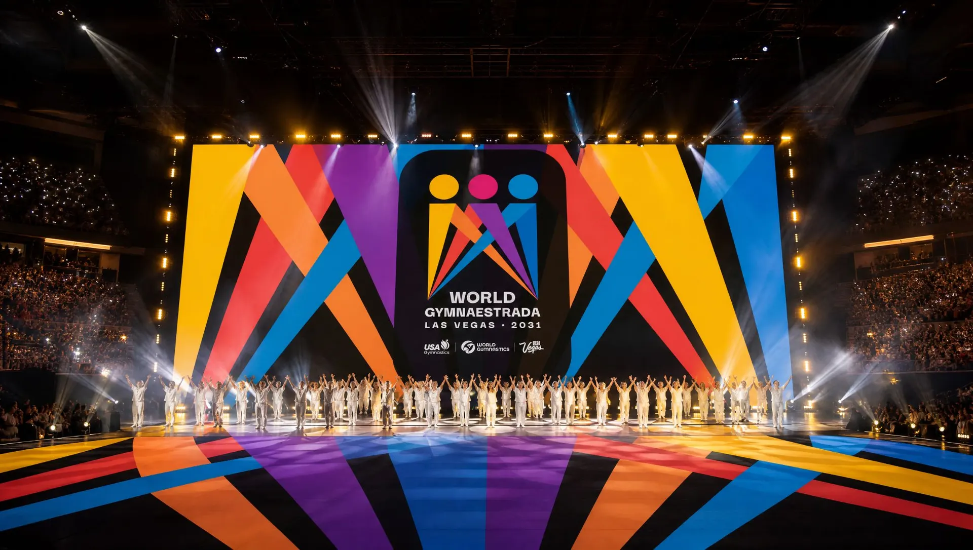
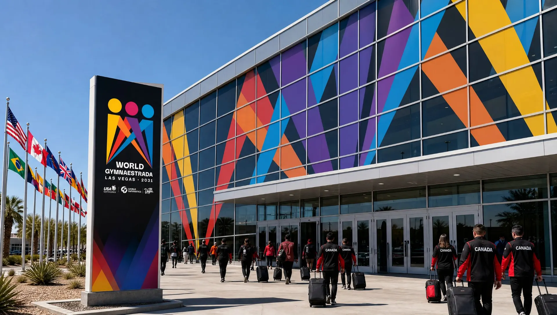
The week runs across the city, from the convention center to MGM Grand Garden Arena to a stage on Fremont Street, so the system has to read as one family from a light pole on the Strip to a pin traded in Lisbon.

06 Brand guide
The guide is a website, so every vendor gets the same files from the same link.
The build
Once the trio was picked, I built the brand guide as a long scroll on ldlr.design, cinematic enough to feel like the event and practical enough to hand to a vendor on day one. Every lockup comes as SVG and PNG, the palette as swatches, CSS and design tokens with Pantone references, and the usage rules follow the kit Lisbon 2027 sends to national federations.


- 01Minimum sizes went up thirty percent.
The people reading it run from first-time gymnasts to their grandparents, often from across a hall, so the stacked primary holds at 29 mm in print and 125 px on screen.
- 02Every mark sits beside its reverse.
Rosa’s test from Round 2 became the rule for the whole guide.
- 03Capitals stop at the lockup.
Only the lockup and the partner row are set in capitals, and headlines, captions and interface copy run in sentence case.
- 04Room for what comes next.
The guide holds forty labeled slots for an icon set built on the event program, and nine wireframe pages for the event website, mapped to the Lisbon handover on July 17, 2027.


07 Outcome
Twenty-five days from kickoff to the final pick.
Where it goes
USA Gymnastics picked the trio on September 13, and Lori sent it to World Gymnastics for approval two days later. Its first public stage is Lisbon in July 2027, on the shirts, jackets and pins the US delegation will trade with the world, four years before twenty thousand performers walk into Las Vegas under it.
Thanks
To Lori Laznovsky and Rosa Poetschke at USA Gymnastics and the World Gymnaestrada 2031 host team, and to James Helms for the introduction. Photography by Rosa Poetschke and USA Gymnastics. Design and build by Leonardo De La Rocha, LDLR Studio.