How a feedback note on a payments feature launch sent one of our designers to typography, the receipt that shows why type is information architecture, and 4 books to start with.
There’s a kind of growth conversation I wish I had more often, and this week it arrived in a 1:1 about typography. One of our designers works on billing and payments. They came to product design from journalism by way of content design, and after they shipped a payments feature that other designers praised unprompted, the feedback they got sent them to study type. They’re halfway through a typography book now, and they described the effect in a line that brought me so much joy: “…it feels like my first time seeing the city, even after living here 3 and a half years.” They live in New York, which might be the best city in the world to have that feeling in.
There’s something really valuable waiting in typography for anyone who organizes information for a living, because a page of type and a product screen have the same job: get the reader to the thing that matters first, make the relationships between the pieces legible, and make the next move obvious.
“What we do in product design, the way we organize our thinking, can improve drastically if you follow a lot of the same principles that we use in typography.”
Scale, weight, spacing and alignment are the tools in both cases, so practicing them where they’re purest, on letters, sharpens them where they’re messiest, on screens full of data and buttons.
The example I had in mind was a receipt. A software founder I follow posted a payout receipt his team designed in the style of an actual paper receipt, because that’s how people already read receipts: it was a very good way to show the information that’s valuable to you and call out the pieces you need to react to. The format itself carries meaning. That’s typography doing information architecture in public, and it maps straight onto the money surfaces this designer owns.
So the direction I gave was narrow: don’t go redesign everything typographically yet, but as you learn, pull that thread on your own surfaces. We set our billing screens in our standard type today, and anything built from numbers, balances and dates can earn an adapted treatment: tabular figures, a clearer hierarchy between the amount and its metadata, alignment that lets a column of numbers be scanned. You can see the difference in how much clearer a statement gets for the person reading it, and clarity about money is the whole job of those screens.
The other half of the conversation was about how to fund this kind of growth. An education budget is exactly for the craft that sits adjacent to someone’s product area. A course from a lettering educator like Martina Flor, who will take a logo everyone knows, dissect it and explain why it works, teaches a dissection habit that transfers straight into product reviews. When a teammate’s craft curiosity lines up with the surfaces they own, fund it, and tell them why you believe it will make their product work better.
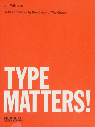
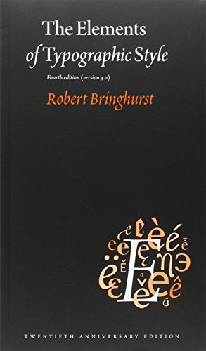
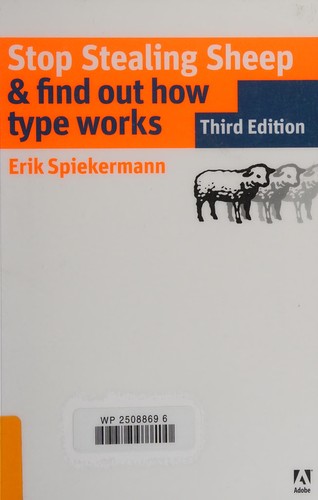
Four books to pull the thread with.
The shelf